Stronger visual preference
Contemporary styling and progressive disclosure.
Preferred overallComparing two concepts, improving everyday payment journeys, and supporting a Design System across app and web.
Each dot represents one participant in the approximate study count.
Participants over 40 also responded well to the contemporary interface with progressive disclosure. Observed task behaviour helped refine the final direction.
Participant count is approximate, based on my project recollection. Team size describes shared design leadership, not direct reports.
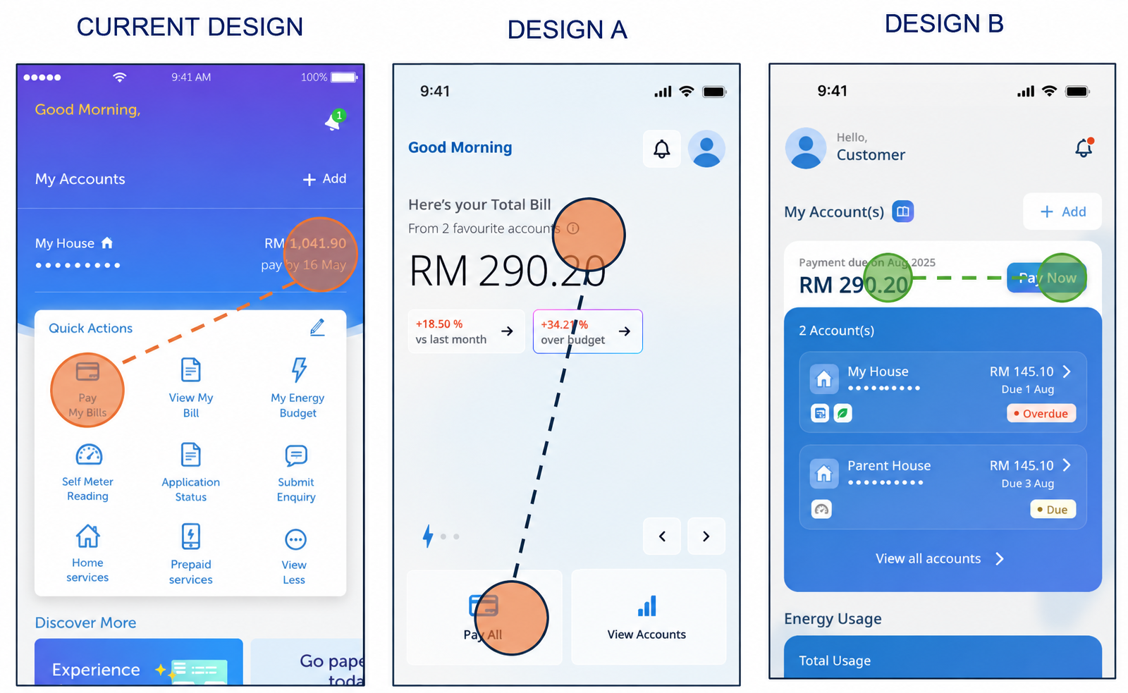
We evaluated two concepts with more than 30 participants using realistic payment and navigation tasks.
Contemporary styling and progressive disclosure.
Preferred overallClearer account selection and payment interactions.
Useful interaction patternsWe combined stated preference with observed behaviour instead of treating either concept as the complete answer.
Research translated broad feedback into changes the team could act on.
Users saw the action but paused before using it.
Use the clearer placement beside the balance due.
Some people monitored accounts they did not pay.
Make it easier to choose which account to view or pay.
Similar layouts made users repeat steps or miss information.
Give account details a recognisable hierarchy and context.
I jointly owned the direction with the Design Lead and guided eight designers in a shared reporting arrangement.
Default, focus, error, loading and empty states.
Purpose-based naming and implementation readiness.
Contrast, keyboard use, responsive layouts and long text.
Usage rules, do/don’t examples, a writing playbook and training.
Standards were developed jointly. Project management maintained formal administration and final sign-off.
The work connected research, shared standards and implementation discussions.
Concept evaluation informed the direction and exposed concrete payment and navigation improvements.
Later testing supported core payment tasks, while discoverability issues remained. Live adoption gains were not established.
Edited project screenshots accompany generalised diagrams of the research and design reasoning. Visuals do not imply measured production outcomes. Work was delivered collaboratively.