Checklist missed
Participants noticed cards and balance information, but did not find the checklist on their own.
Evaluating how fleet managers discover help, interpret instructions and complete first-time setup.
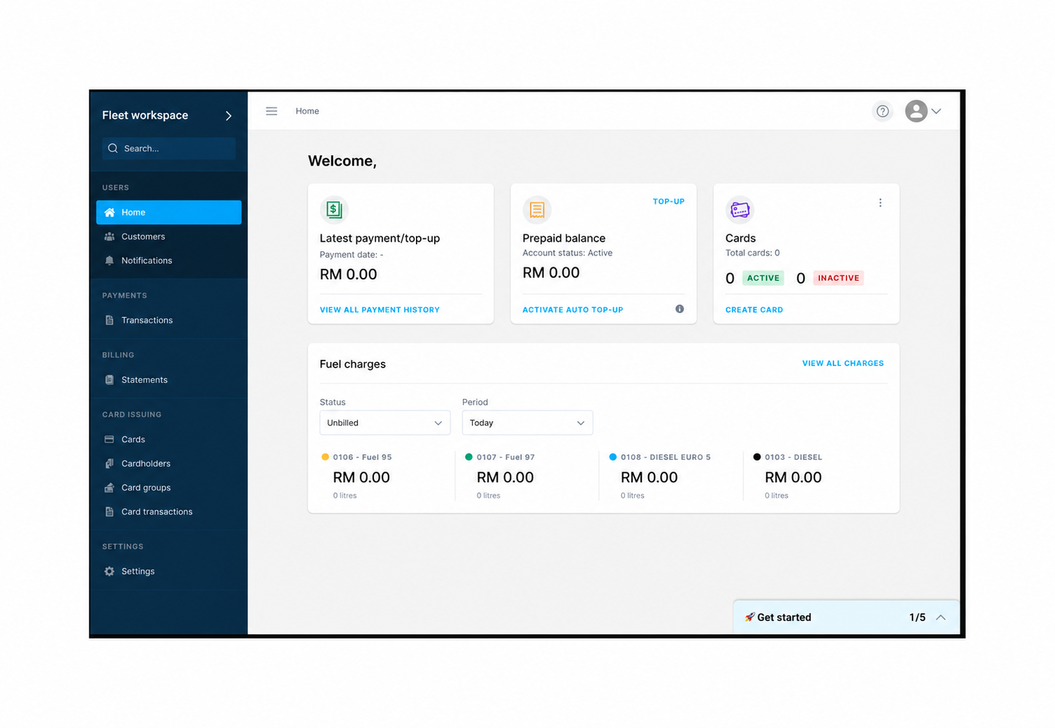
Participants valued the guidance once introduced. The priority was to make it visible at the point of need.
Source: onboarding usability report, five moderated sessions. Five hours is calculated from five scheduled 60-minute sessions. This small study does not estimate population-wide behaviour.
Five experienced fleet managers took part in 60-minute, face-to-face prototype sessions.
Participants noticed cards and balance information, but did not find the checklist on their own.
Participants understood the checklist and wanted it available for future use and staff handovers.
Place help where users expect it and keep it accessible after first-time onboarding.
Fleet managers brought habits from physical-card workflows to a new digital service.
Fund the account first.
Set up the card afterwards.
Establish the card.
Configure its intended use.
Add funds.
The proposed ordering required further usability testing. It is not presented as a shipped or validated replacement.
My research contribution focused on evaluating the prototype and translating observed behaviour into recommendations.
Users thought they needed to create another account.
Differentiate finished steps from actions still required.
Users tried clicking controls inside guidance images.
Show where the real action begins.
Verification felt familiar; the linked wallet later caused confusion.
Clarify what is being linked before reaching payment.
Users were unsure whose phone number to provide.
Specify driver details and identify optional fields.
The study connected support-team observations with real first-use behaviour.
Improve checklist placement, preserve access to help, clarify labels and re-evaluate the task sequence.
The study identifies usability issues. It does not quantify increased top-ups, card creation or reduced support demand.
Edited project screenshots accompany generalised diagrams of the research and design reasoning. Visuals do not imply measured production outcomes. Work was delivered collaboratively.